I will trying to turn Olathe Northwest High Schools web design:
Link to site
Into Purina's web design:
Link to site
Wednesday, April 18, 2018
Tuesday, April 17, 2018
Smittys Lawn and Garden
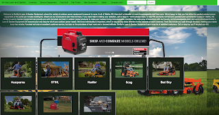
This is an image of the site that I made. This is a recreation of Smitty's Lawn and Garden but what is different about this site is that this site is a Mobile-First version of the site which means that a web designer starts from the site looking as it would on a phone then move up until it would look like tell it was on a computer. This first image is the site when it is full screen on a computer.
This version of the site is what it would like if the site was on a phone. Do you notice that the nav bar at the top of the page folds into a hamburger menu? Also the paragraph folds in to fit the screen. Then the carousel becomes small to also fit the screen and finally the images and the caption go into more rows with one being in each row.
This is the site as it would be seen on a tablet. The nav bar covers three rows and because of that I had to move the paragraph down to be seen because if I had not added a media query then the viewer would not be able to see the paragraph. The carousel in this image has not scrunched yet and the images with captions have covered some rows and has put three images per row.
Monday, April 16, 2018
Jabberwocky
For this project I had to change the CSS to make it look better without changing the HTML, it was a tab bit hard to do but it wasn't very bad. Even though it could have looked better.
First, what I did was I made the background image cover the entire website. Then, I separated out each of the pieces of text into different divs. I had to also add in color and I made some of the text have weirdly colored shadows which makes it look old school. In the end I probably could have a better color scheme and not add as many shadows onto the text but besides those things it was alright.
This is the Jabberwocky site:
Jabberwocky Site
Subscribe to:
Comments (Atom)
Web Hosting Options
InMotion 1&1 Bluehost
-
This was my second thought since I probably should make the logo a bit similar so I mad this idea, it has the same type of fonts as my fi...
-
There are many things that I like about Web Design so far. One being the community in web design the people are awesome. Another thing are t...


